§ 00 · Brand reference
A small spec.
Enough to stay coherent.
Era Haus is a business strategy practice for the AI era. The brand should read as quiet, editorial, and considered — closer to a research imprint than a SaaS landing page. This page is the working reference: logo, color, typography. If something here contradicts the live site, the live site is wrong and gets fixed.
Logo
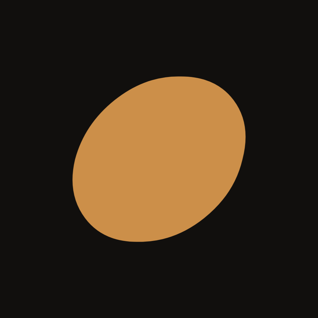
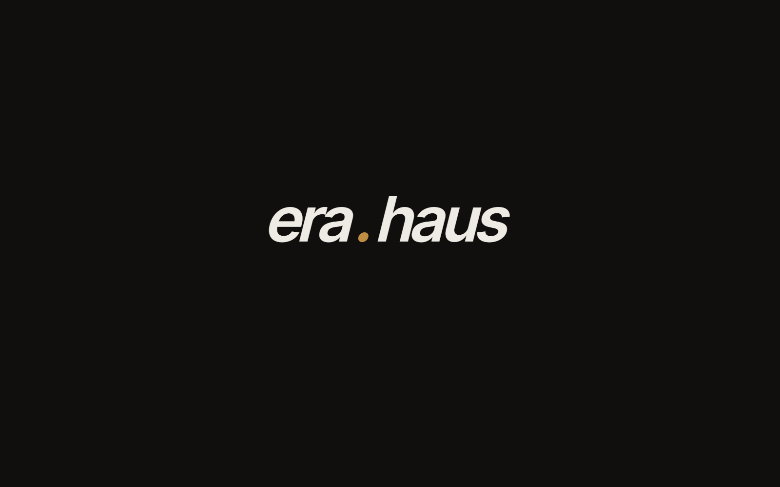
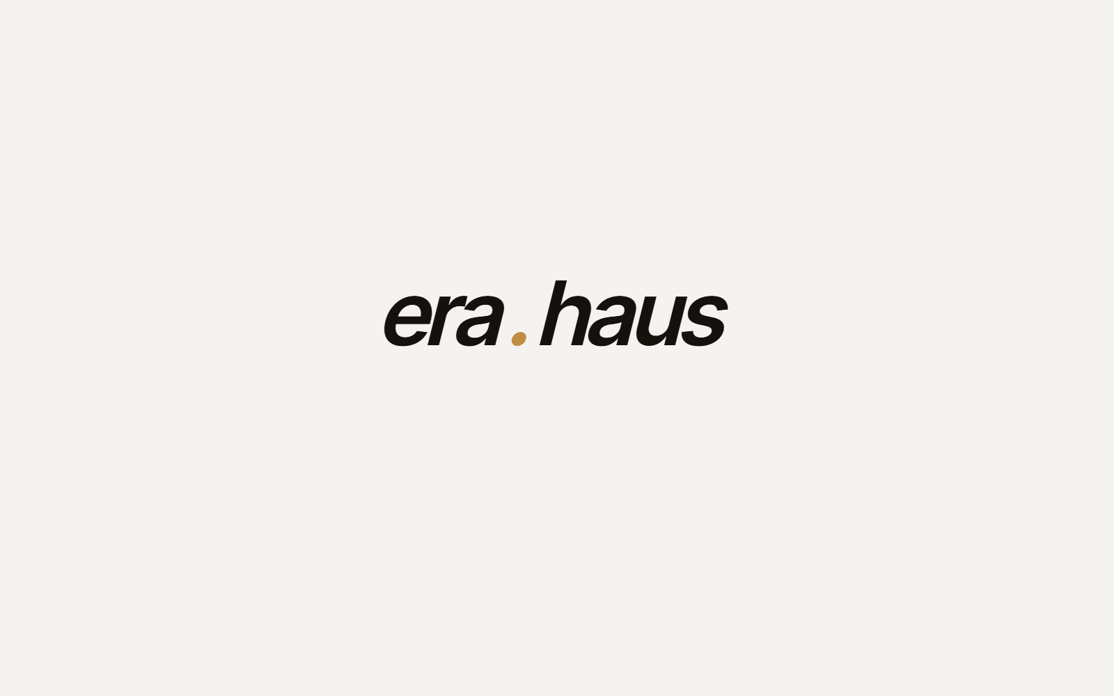
The wordmark is era.haus set in Inter Tight italic, semibold, with the period rendered in ochre. The mark, used alone, is the period — an italicised ellipse tilted just shy of 50°. Both read at small sizes; both survive on ink or paper backgrounds.
Wordmark
Square lockup
Mark only

Clearspace: keep at least the height of the dot on every side. Don't recolour the mark — ochre is the only accent. Don't outline the wordmark, don't stack the words, don't put the period anywhere other than between era and haus.
Color
Two ink surfaces, one paper surface, four neutrals, three accents. Defined in OKLCH so contrast stays consistent across screens. Ochre is the primary accent (used in the logo and most live UI). Clay and olive are reserved — small details, PDFs, future expansion. Paper is the canonical light background, also used for PDF reports. Live tokens are in app/globals.css.
Typography
Three families, each with one job. Serif sets the editorial register; sans carries body and UI; mono handles system metadata. No display faces, no decorative cuts.
Strategic clarity for the AI era.
Era Haus is an advisory and research practice helping leaders think clearly about AI.
§ 01 · BUSINESS STRATEGY · ADVISORY · RESEARCH
Voice
- Specific over slogans.Name companies, numbers, and dates. No “the future of work” abstractions.
- Judgment over jargon. A reader should feel an actual point of view, not a survey of opinions.
- Research, not predictions. Falsifiable claims with evidence beat confident forecasts.
- Quiet by default. No exclamation marks, no emoji, no CTA stacking. The whitespace does work.
- Anti-hype.If a sentence could appear in any AI consultant's newsletter, rewrite it or cut it.